She's here! That horrible, adorable little fur monster I've been posting about finally has a face to go with the shenanigans.
Guys, gals, and nonbinary pals, I'd like you to meet Kivara, the Charishi kitten from my short story and upcoming novel, Upholding the Covenant.
Guys, gals, and nonbinary pals, I'd like you to meet Kivara, the Charishi kitten from my short story and upcoming novel, Upholding the Covenant.
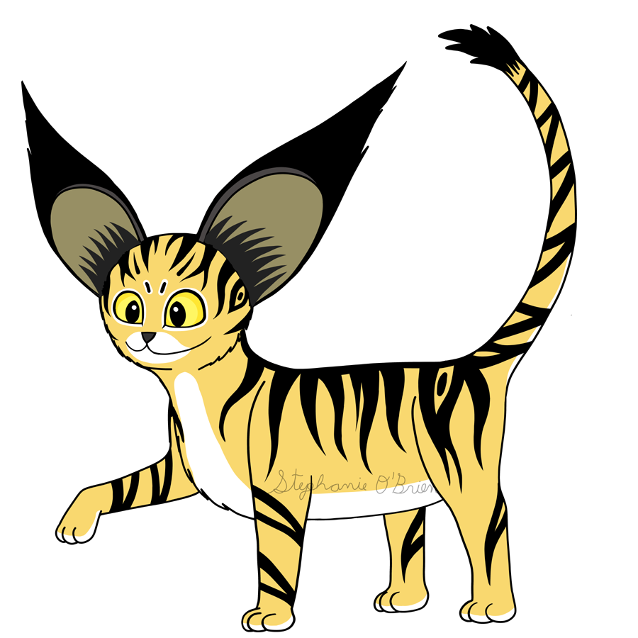
This picture put up a heck of a fight, which is appropriate for a kitten who will try to fight ANYTHING from loudly dropped boxes to thunderstorms.
You'd think an artist who's lived with cats almost my whole life would know how to draw them, but nope, I did not. At all. So this picture was a total learning curve for me, and it looked like ass until I added the stripes. After that, it all started coming together.
I had a rough idea of what Kivara looks like, but a lot of the details needed to be ironed out and experimented with on the fly, so I was actually designing Kivara while I drew her.
I decided to record the process for a speedpaint, which I'll release soon, and even though I did a rough practice round before starting to record in earnest, the parts I recorded still added up to almost six hours.
And that's not even including the bits of tinkering I did while the second-last video was rendering and I thought I was done (before I realized the ears needed fixing), and widening her raised forelimb to match the planted one!
Still, I'm glad I stuck with it, and didn't let that struggle be the final word on whether or not I could introduce Kivara's cute, bratty face to the world. I think this picture captures not only her appearance, but her alert, energetic, inquisitive and mischievous personality.
Designing not just a character, but a species.
Kivara is the first Charishi I've ever drawn, so to some extent I was figuring out their traits as a species while I was drawing her.
I wanted to give the Charishi more distinctive physical features to differentiate them from real-life felines and make them more unique, but so far, most of the ideas I've had just haven't felt right. The one thing that did stick was those big, triangular tufts of fur on the ends of their rounded ears.
Speaking of which, Charishi ears aren't normally that huge; Kivara's just special that way. She's the runt of the litter, but she has the voice, ears and attitude of a much larger creature, haha.
As she grows, her forelimbs' digits will elongate into fingers, and she'll start to shift to a bipedal stance as her default way of walking. But she'll still be able to drop to all fours for a startling burst of speed!
She'll also start to wear clothes; I need to figure out what kind of outfits the Charishi wear. Probably some sort of loose, roughly knee-high robe that can comfortably accommodate both bipedal and quadrupedal locomotion.
If you like this bratty baby enough to bring her into your house, you can get Kivara on T-shirts, stickers, coffee mugs and more in my RedBubble and Society6 stores!
And if you want to learn more about Kivara, her species, and the world she lives in, you can follow me on social media to get notified when I share more updates.


 RSS Feed