Starting a long-running webcomic is a big undertaking. There are a lot of things to keep track of, skills to hone, and tips and tricks that can make the process easier, as I've discovered over the year and a half that's passed since I first started working on my Undertale webcomic, Just Cause.
A fellow artist recently expressed interest in picking my brain, so I thought, "Hey, why not turn this into a blog post, so everyone can benefit from all this experience and brain-picking?"
And so, here we are, taking a look at the seven things I wish I'd known when I started out.
Some of these tips are specific to digital artists in general and Photoshop users in particular, but if your image editor includes layers, most of what I say will work for you.
Webcomic Lesson 1: Start with a template.
One of the best decisions I made when I first started to draw Just Cause was to make a template I could use for each page.
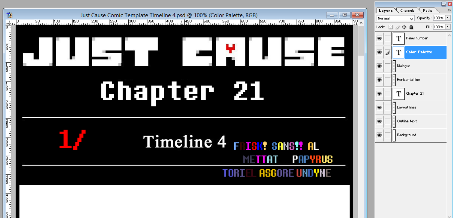
This template consists of several layers:
1. The outline text
This is the first layer above the background, where I write my notes about what goes in each panel. The characters' names, poses, facial expressions, backgrounds, items, or anything else I need to know in order to draw that panel go into the outline text.
This helps me to figure out the layout of the comic, and to know what goes where, before I even start to draw.
I recommend keeping the outline text layer separate from the background layer, so if you want to move a piece around, you can do so easily without leaving a blank space where the section of text used to be.
I usually use a pale grey shade for my outline text, so it isn't too obtrusive or distracting.
I've also found that, in Photoshop 7.0 at least, it's good to have a single pixel on the outline text layer, so it doesn't turn into a text layer when I start to write on it. This way, starting to write creates a new layer, which can be merged into the outline layer when it's done.
2. The text for the dialogue
Back when I was mostly drawing my comics on paper, I had a chronic problem where I'd draw the panel, then realize I had no room for the word bubbles.
Now, I add the dialogue text during the planning phase, so I know exactly where it goes and how much room it takes up before I draw anything.
This is especially important for a webcomic that I'm trying to make mobile-friendly. When you're making the dialogue text big enough to (hopefully) be readable on a smartphone, you end up with some pretty big word balloons!
I try to make my dialogue paragraphs as circular or ovular as I can - narrow at the top and bottom, wider in the middle - so they fit neatly into rounded word balloons.
I also use a color other than black and white, so the text is visible against both the white background and the black word balloons I'll later add. I'll turn it white after I add the word balloons, but in the planning stages, it needs to stand out against both.
3. The layout lines
Once I've used the outline text to determine where each panel goes, I use the layout line layer to create lines between the panels. This layer stays near the top of the Photoshop file, and the panels are drawn beneath it.
That way, I don't have to worry about accidentally coloring on the lines that separate the panels, since those lines are in a layer above the panel layers.
I recommend NOT using anti-aliased lines for your layout lines, except for the diagonal ones. It gives the lines a sharper, cleaner appearance, and makes it more obvious if you've made a line crooked and need to fix it.
4. The panel number
This is one of the more unusual elements of my process, because it actually has nothing to do with drawing the comic.
I'd noticed that some artists who had a variable release schedule were plagued by people demanding to know when the next page would be available - which, while flattering, can also create a lot of pressure for the artist, and it can become annoying if too many people are doing it.
So to make the wait easier for my readers and the comments section more pleasant for me, I created a progress bar that indicates how far I've gotten in drawing each new page.
Every time I finish drawing a couple panels, I update the progress bar. Trouble is, that means I have to keep counting how many panels I've drawn - which, in the longer pages, can get tedious.
So I created a text layer that indicates how many panels I've drawn and how many are in the page overall. Every time I finish a panel, I simply change the number in the "panel number" layer.
5. The color palette
Because I use soft shading, as opposed to cel shading, it's sometimes hard to tell where the base color ends and the light and shadow begin. This can cause me to lose track of which shade I'm supposed to start out with when drawing the characters.
I eventually got sick of repeatedly having to look up sprites or open separate files with unshaded versions of the characters, so I included a color palette layer.
This layer basically consists of the characters' names, with the letters written in their various colors.
6. The word balloons
In Photoshop, when you write a bit of text, it creates a new layer. On the layer directly below these new text layers, I have a dedicated layer for word balloons, labeled "Dialogue".
Once I've got the comic's layout fully figured out, I create the word balloons below their respective bits of text, then merge the text down into the word balloons.
While you're doing this, double-check to make sure the text is the way you want it before merging; once it's merged, you can no longer type in that paragraph, backspace, italicize, or anything like that. Basically, it stops being text, and becomes a picture of text.
7. The chapter number
This, along with the chapter name being visible at the top of the template, is an element I added in response to a specific frustration I experienced as a reader.
Sometimes, when I'm scrolling through Tumblr, I see a comic and start to read it... only to realize that it's a later chapter in a comic I'm reading but haven't caught up with yet, and I just gave myself spoilers.
To avoid doing the same thing to my readers, I have the comic title embedded as a permanent feature in the layout lines, and an editable text layer with the chapter number in the template. No spoilers for the unprepared!
8. A horizontal line
Have you ever had a time when you tried to use the line tool to make a perfectly straight line, only to find that the very act of clicking nudged the mouse or touchpad enough to make it crooked? I have. SO MANY TIMES.
So rather than deal with that frustration every time I want to make a line to separate one row of panels from another, I just have a separate layer with a horizontal line that I can copy, paste, move, and then merge down into the layout line layer.
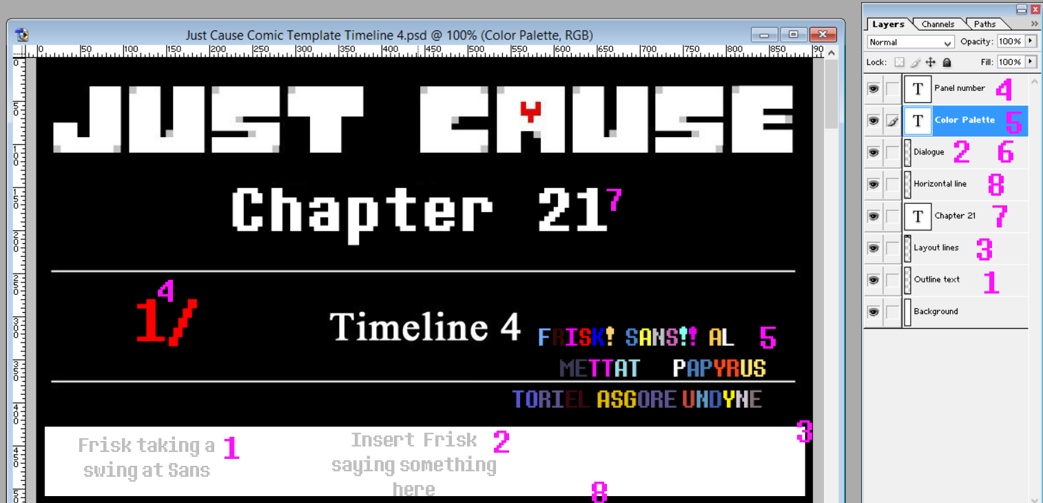
Here's an example of a page template, with all the elements labeled by number.
The number labels are in bright pink, to differentiate them from the other numbers in the template.
I forgot to add a separate layer for the dialogue text in the screenshot before editing, and I was almost done by the time I realized, so... just pretend it's there, OK?
1. The outline text
2. The text for the dialogue
3. The layout lines
4. The panel number
5. The color palette
6. The word balloons (not yet added in this stage of planning out the comic)
7. The chapter number
8. The horizontal line
1. The outline text
This is the first layer above the background, where I write my notes about what goes in each panel. The characters' names, poses, facial expressions, backgrounds, items, or anything else I need to know in order to draw that panel go into the outline text.
This helps me to figure out the layout of the comic, and to know what goes where, before I even start to draw.
I recommend keeping the outline text layer separate from the background layer, so if you want to move a piece around, you can do so easily without leaving a blank space where the section of text used to be.
I usually use a pale grey shade for my outline text, so it isn't too obtrusive or distracting.
I've also found that, in Photoshop 7.0 at least, it's good to have a single pixel on the outline text layer, so it doesn't turn into a text layer when I start to write on it. This way, starting to write creates a new layer, which can be merged into the outline layer when it's done.
2. The text for the dialogue
Back when I was mostly drawing my comics on paper, I had a chronic problem where I'd draw the panel, then realize I had no room for the word bubbles.
Now, I add the dialogue text during the planning phase, so I know exactly where it goes and how much room it takes up before I draw anything.
This is especially important for a webcomic that I'm trying to make mobile-friendly. When you're making the dialogue text big enough to (hopefully) be readable on a smartphone, you end up with some pretty big word balloons!
I try to make my dialogue paragraphs as circular or ovular as I can - narrow at the top and bottom, wider in the middle - so they fit neatly into rounded word balloons.
I also use a color other than black and white, so the text is visible against both the white background and the black word balloons I'll later add. I'll turn it white after I add the word balloons, but in the planning stages, it needs to stand out against both.
3. The layout lines
Once I've used the outline text to determine where each panel goes, I use the layout line layer to create lines between the panels. This layer stays near the top of the Photoshop file, and the panels are drawn beneath it.
That way, I don't have to worry about accidentally coloring on the lines that separate the panels, since those lines are in a layer above the panel layers.
I recommend NOT using anti-aliased lines for your layout lines, except for the diagonal ones. It gives the lines a sharper, cleaner appearance, and makes it more obvious if you've made a line crooked and need to fix it.
4. The panel number
This is one of the more unusual elements of my process, because it actually has nothing to do with drawing the comic.
I'd noticed that some artists who had a variable release schedule were plagued by people demanding to know when the next page would be available - which, while flattering, can also create a lot of pressure for the artist, and it can become annoying if too many people are doing it.
So to make the wait easier for my readers and the comments section more pleasant for me, I created a progress bar that indicates how far I've gotten in drawing each new page.
Every time I finish drawing a couple panels, I update the progress bar. Trouble is, that means I have to keep counting how many panels I've drawn - which, in the longer pages, can get tedious.
So I created a text layer that indicates how many panels I've drawn and how many are in the page overall. Every time I finish a panel, I simply change the number in the "panel number" layer.
5. The color palette
Because I use soft shading, as opposed to cel shading, it's sometimes hard to tell where the base color ends and the light and shadow begin. This can cause me to lose track of which shade I'm supposed to start out with when drawing the characters.
I eventually got sick of repeatedly having to look up sprites or open separate files with unshaded versions of the characters, so I included a color palette layer.
This layer basically consists of the characters' names, with the letters written in their various colors.
6. The word balloons
In Photoshop, when you write a bit of text, it creates a new layer. On the layer directly below these new text layers, I have a dedicated layer for word balloons, labeled "Dialogue".
Once I've got the comic's layout fully figured out, I create the word balloons below their respective bits of text, then merge the text down into the word balloons.
While you're doing this, double-check to make sure the text is the way you want it before merging; once it's merged, you can no longer type in that paragraph, backspace, italicize, or anything like that. Basically, it stops being text, and becomes a picture of text.
7. The chapter number
This, along with the chapter name being visible at the top of the template, is an element I added in response to a specific frustration I experienced as a reader.
Sometimes, when I'm scrolling through Tumblr, I see a comic and start to read it... only to realize that it's a later chapter in a comic I'm reading but haven't caught up with yet, and I just gave myself spoilers.
To avoid doing the same thing to my readers, I have the comic title embedded as a permanent feature in the layout lines, and an editable text layer with the chapter number in the template. No spoilers for the unprepared!
8. A horizontal line
Have you ever had a time when you tried to use the line tool to make a perfectly straight line, only to find that the very act of clicking nudged the mouse or touchpad enough to make it crooked? I have. SO MANY TIMES.
So rather than deal with that frustration every time I want to make a line to separate one row of panels from another, I just have a separate layer with a horizontal line that I can copy, paste, move, and then merge down into the layout line layer.
Here's an example of a page template, with all the elements labeled by number.
The number labels are in bright pink, to differentiate them from the other numbers in the template.
I forgot to add a separate layer for the dialogue text in the screenshot before editing, and I was almost done by the time I realized, so... just pretend it's there, OK?
1. The outline text
2. The text for the dialogue
3. The layout lines
4. The panel number
5. The color palette
6. The word balloons (not yet added in this stage of planning out the comic)
7. The chapter number
8. The horizontal line
Webcomic Lesson 2: Use what feels natural.
When I first started drawing my webcomic, I wanted to keep it simple and fast, so I decided to use cel shading.
I told myself, "I'll just do one layer of shading, AND NO MORE!"
As you can see, that commitment didn't last.
Even in the first page of the comic, when I was still trying to restrict myself to simple shading, I found that the TV was easier to draw with soft and complex shading to define its various planes and slopes.
After a few chapters, I concluded that I was spending more time trying to figure out how to make things look good with hard shading than I'd spend just doing the soft shading that came more naturally to me.
So I went with my natural tendencies, and started creating better art in less time as a result.
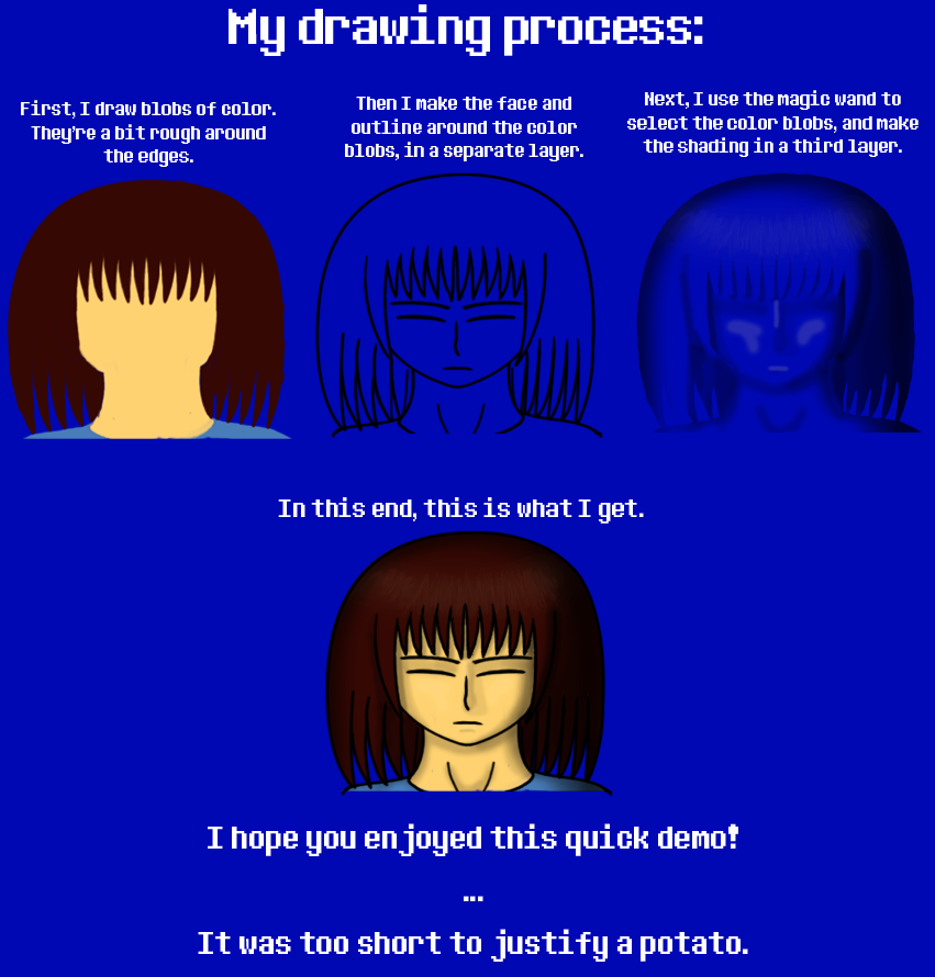
Even before I start to shade, my overall process for drawing things tends to differ from most of the processes and advice I've seen.
I usually see people recommending that you do a sketch layer first, then a lineart layer, then fill in the lines with color.
Personally, after making a rough sketch to get an idea of where all the body parts go, I find it easier to start with the color, sculpt it until it's the shape I want, then draw lines around that.
It's less effort to shave a couple millimeters off of a blob of color than it is to change the position and shape of a line, at least for me.
As a result, my drawing process after the sketch phase tends to look like this:
After a few chapters, I concluded that I was spending more time trying to figure out how to make things look good with hard shading than I'd spend just doing the soft shading that came more naturally to me.
So I went with my natural tendencies, and started creating better art in less time as a result.
Even before I start to shade, my overall process for drawing things tends to differ from most of the processes and advice I've seen.
I usually see people recommending that you do a sketch layer first, then a lineart layer, then fill in the lines with color.
Personally, after making a rough sketch to get an idea of where all the body parts go, I find it easier to start with the color, sculpt it until it's the shape I want, then draw lines around that.
It's less effort to shave a couple millimeters off of a blob of color than it is to change the position and shape of a line, at least for me.
As a result, my drawing process after the sketch phase tends to look like this:
And that brings me to the next thing I REALLY wish I'd known earlier...
Webcomic Lesson 3: Put the color, shade and outlines in separate layers.
Coloring within the lines is SO much easier when those lines aren't on the same layer as the color.
When the outlines are in a layer above the color, it doesn't matter if the color brush overlaps with the lines a bit; the lines are hovering above the color, so they won't be affected.
That way, your nice, smooth lines stay nice and smooth, and you can color more quickly because you don't have to be as careful.
The same goes for the shading. If you realize you've put some shading where you don't want it, it's nice to be able to just erase it without accidentally erasing the base color beneath it in the process.
This separation of layers also facilitates another trick I've learned, which is...
Webcomic Lesson 4: Cheat your butt off.
Here's the part where I reveal my dirty little secret: I cheat.
By "cheat", I mean I follow in the footsteps of Andrew Hussie and several other webcomic artists whose stories I enjoyed, and use copying and pasting to make my work go faster.
If I have two panels with the same character in the same pose, instead of drawing the second panel from scratch, I'll simply copy the character from the first panel, paste them into the second panel, then change details like shading and the facial expression if need be.
I've even gone so far as to keep a folder full of stock poses for various characters, and some mix-and-match items like certain hair positions for Frisk that I can paste onto their head.
This folder is sorted by character, and each character's file includes accessories like their magic attacks as well as the poses.
By keeping the base color, outline and shade layers separate, I'm able to re-shade the images easily, which helps to keep the pictures from looking recycled and repetitive.
It also helps with situations where the light direction is different in the new panel than it was in the panel in which the pose was first drawn.
One note of caution when using this art hack: if you take a stock pose and increase its size, it can get noticeably blurry.
If you expect to use a pose a lot, I recommend making a big version first and putting it in your stockpile, then shrinking it to fit the panel.
Or, if you started out with a small version and then needed a big one, you can delete the now-blurry outline and redo it, while keeping the base color intact. Isn't layer separation great?
Is this trick a bit lazy? Maybe.
But when the text file for your comic is 181 pages long, and it isn't even finished yet, you either find ways to make the process go faster, or accept that you're probably going to be doing this for the next decade.
Webcomic Lesson 5: Keep track of the characters' locations.
One of my biggest challenges has been keeping track of where the characters are relative to each other and their surroundings, and where the light is hitting them from, in scenarios where they move around a lot.
Fight scenes are a HUGE pain in the butt that way.
I've found that it helps to have a model of the area you're drawing, and icons that indicate where the characters are.
Even if it's just a bird's-eye view of the ground, and text layers with the characters' names that you can move around, this will help you to keep track of where everyone is in any given panel, so you don't have people or light sources teleporting around.
Webcomic Lesson 6: Let it go.
When you start a webcomic, there are several things you have to let go of.
First, let go of the need to be perfect before you start, because your art style will inevitably evolve, and your best work now will look like crap to you later.
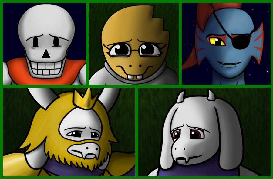
Case in point: Sans before, and Sans now:
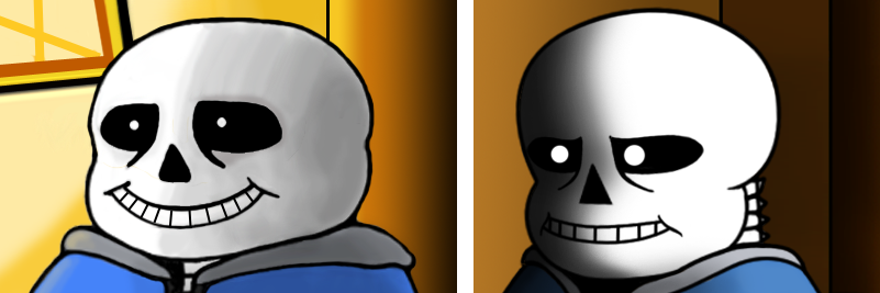
I mean, just look at the awful, lumpy marshmallow potato he used to be.
And yet, no one complained about the quality of the art. That brings me to the second thing you have to let go of: being perfect AT ALL.
Webcomic panels don't have to be art-critique-ready levels of flawless; they just have to effectively convey the scene, actions and emotions in them.
People want to see the next chapter in the story more than they want the art to be perfect, and good dialogue and plotlines are more important than impeccable drawing.
Yes, if a picture looks wrong to you, it's probably a sign that something needs to be adjusted. And for me, there are few feelings more satisfying than finally figuring out what was making the picture look off, and watching it become awesome - often with a relatively minor tweak.
But bear in mind, you'll spend a lot more time drawing each panel and getting acquainted with its flaws than your readers spend will looking at it.
So unless you're planning to submit the image to a group that's specifically designed to provide constructive criticism, almost no one besides your most dedicated and observant readers will notice minor errors - and those sharp-eyed few are usually the ones who love your story, warts and all.
And if you do get critics who are just looking for something to complain about?
Evaluate their criticism carefully, use the accurate observations to improve, offer courteous correction to the accidentally inaccurate assessments, and ignore, block, or have some mischievous fun with the ones who are just throwing insults without providing any useful information.
Whatever helps you keep up your confidence and motivation to keep drawing.
Webcomic Lesson 7: DON'T let it go.
There are some things you SHOULD let go of.
Your passion for your story, your enjoyment of the process of creating great art, and your determination to see the project through are not among them.
When you're starting to feel discouraged, pause. Look at the number of views and favorites you've gotten on DeviantArt, think about the scenes you look forward to drawing, and remember that even the most popular artists started out obscure.
They didn't hone their craft, enjoy their own art, complete their stories, or get a raving fan base by giving up.
They kept creating great content, gathering followers as they went, and building up - sometimes gradually - to where they are today.
I'm not a wildly popular storyteller yet. Someday, I want to be.
More importantly, I PLAN to be, no matter how long it takes.
I have stories I want to share with the world, lives I want to touch, people I want to make happy, deep contemplations and discussions I want to inspire, and wounds I want to heal in my readers by helping them to understand themselves better through watching my characters evolve.
I have fan art of my stuff that I want to see, even though it hasn't been drawn yet, and fanfiction I want to read.
I'm not going to stop before that dream becomes reality. And neither should you, whatever your dream happens to be.
Now take these tips, or whichever of them sound useful to you, get out there, and tell your story. Your readers are waiting for you.
 RSS Feed