I was recently asked how I draw the semi-realistic fire in my webcomic, so I made a quick tutorial.
|
|
|
|
I was recently asked how I draw the semi-realistic fire in my webcomic, so I made a quick tutorial.
0 Comments
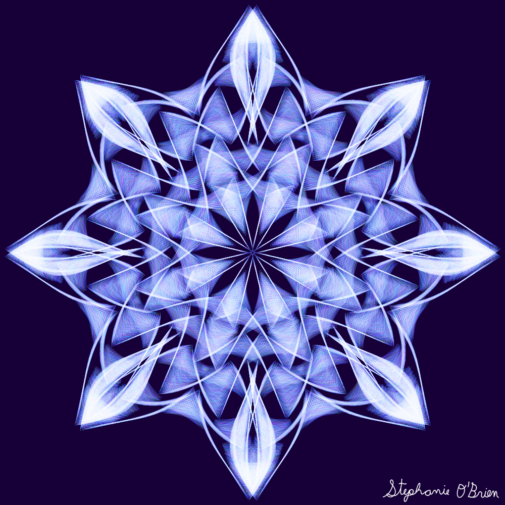
My last snowflake-drawing video got such a positive reception on YouTube that I was motivated to make another. :) This time I made the background slightly more intricate, and included the process of drawing the gold decorations in the video. Music credits:
Intro: Etherial Choir Ascends By Doug Maxwell/Media Right Productions (YouTube Audio Library) The rest of the video: Djinn By Francis Preve (YouTube Audio Library) Synth Wind By Geographer (YouTube Audio Library) Into the Sky By Jeremy Blake (YouTube Audio Library) Reconciliation By Asher Fulero (YouTube Audio Library) Below the cut, you can see the snowflakes I drew in the montage. Frozen Zephyr: 10 Minutes of Drawing Snowflakes While Peaceful, Dramatic Space Music Plays28/3/2020 It's been some time since I did a snowflake-drawing montage, and I was getting the urge to do it again. With COVID-19 forcing so many people into quarantine, I also felt a pull as an artist to offer those who are trapped in their homes a bit of escape and entertainment. So if you want a relaxing way to pass the time, click the video player below to watch beautiful snowflakes taking shape while peaceful, dramatic space music plays. Music credits:
Etherial Choir Ascends By Doug Maxwell/Media Right Productions (YouTube Audio Library) Ladybug By Jeremy Blake (YouTube Audio Library) Space Trooper By DivKid (YouTube Audio Library) TENFOLD By Density & Time (YouTube Audio Library) Below the cut, you can see the snowflakes I drew in the montage.
Amethyst in the OceanMusic credits: Shoulder Closures By Gunnar Olsen (YouTube Audio Library) Darkest Child A Darkest Child A by Kevin MacLeod is licensed under a Creative Commons Attribution license (https://creativecommons.org/licenses/by/4.0/) Source: http://incompetech.com/music/royalty-free/index.html?isrc=USUAN1100783 Artist: http://incompetech.com/ That Kid in Fourth Grade Who Really Liked the Denver Broncos That Kid in Fourth Grade Who Really Liked the Denver Broncos by Chris Zabriskie is licensed under a Creative Commons Attribution license (https://creativecommons.org/licenses/by/4.0/) Source: http://chriszabriskie.com/uvp/ Artist: http://chriszabriskie.com/ Frost in the VoidMusic credits: Retreat By Jason Farnham (YouTube Audio Library) Through The Crystal By Jeremy Blake (YouTube Audio Library) Absolutely Nothing By Jeremy Blake (YouTube Audio Library) Prelude No. 6 Prelude No. 6 by Chris Zabriskie is licensed under a Creative Commons Attribution license (https://creativecommons.org/licenses/by/4.0/) Source: http://chriszabriskie.com/preludes/ Artist: http://chriszabriskie.com/ Iced VelvetMusic credits: Gone Beyond Gone Beyond by Kevin MacLeod is licensed under a Creative Commons Attribution license (https://creativecommons.org/licenses/by/4.0/) Source: http://incompetech.com/music/royalty-free/index.html?isrc=USUAN1100752 Artist: http://incompetech.com/ Getting There By Silent Partner (YouTube Audio Library) Ticker By Silent Partner (YouTube Audio Library) Meadow By Density & Time (YouTube Audio Library) Want to learn how to draw patterns like these?I've got a handy art tutorial that walks you through every step of the process. You can watch the first video in the tutorial here: In this art class, you'll discover how to draw symmetrical snowflake patterns in Krita, and sell them on sites like Society6 and RedBubble. This video provides the intro; you can see the full 41-minute tutorial on SkillShare here. Want to decorate your clothing or home with these snowflakes?
Want to see these snowflakes at full size?I drew A LOT of snowflakes during these recording sessions, so getting them uploaded and shared on all my public channels will take time. For now, my supporters on Patreon can get early access to the full set of snowflakes here:
Amethyst in the Ocean Frost in the Void Iced Velvet I recently watched a course on SkillShare called The Art of Subtraction. It teaches people how to draw background patterns and textures for their art, then give shape to their creation by erasing portions of it. I've already used a similar method for pieces like "Chaotic Hearts", but the class gave me ideas for how to expand on the technique, so I decided to complete the class project - which is, create 3-5 pieces of artwork by subtracting from a drawing. The result was this 3-part art series, "Subtracting Night from Rainbows". Maid of Stars and Rainbows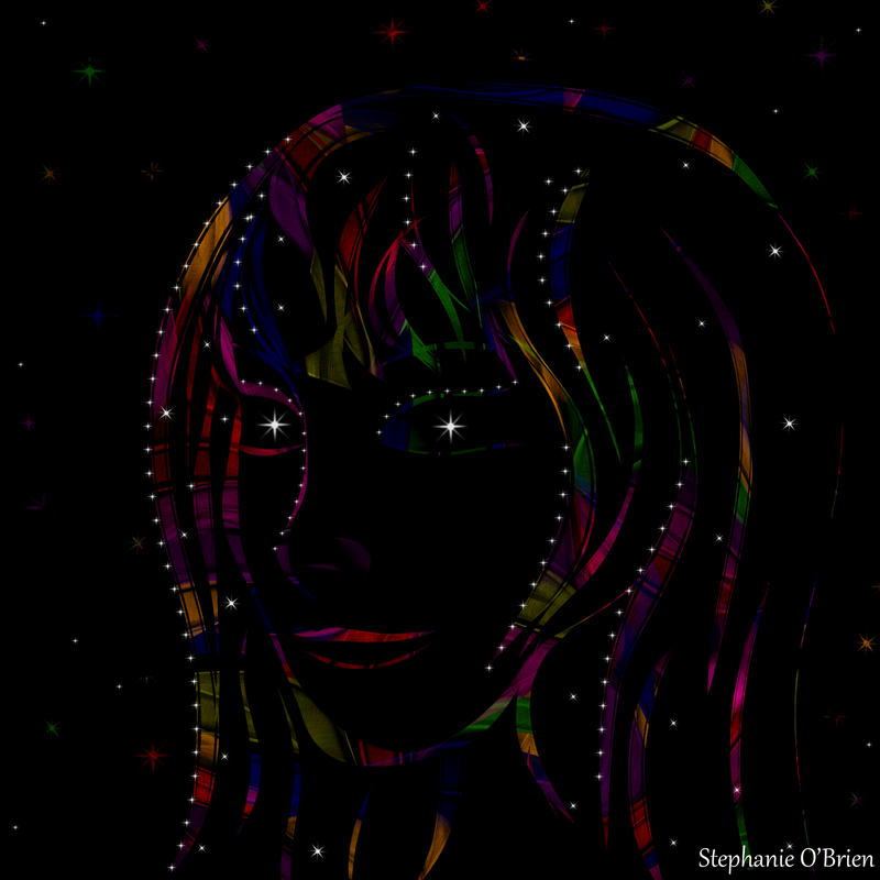 Forest of Weeping Jewels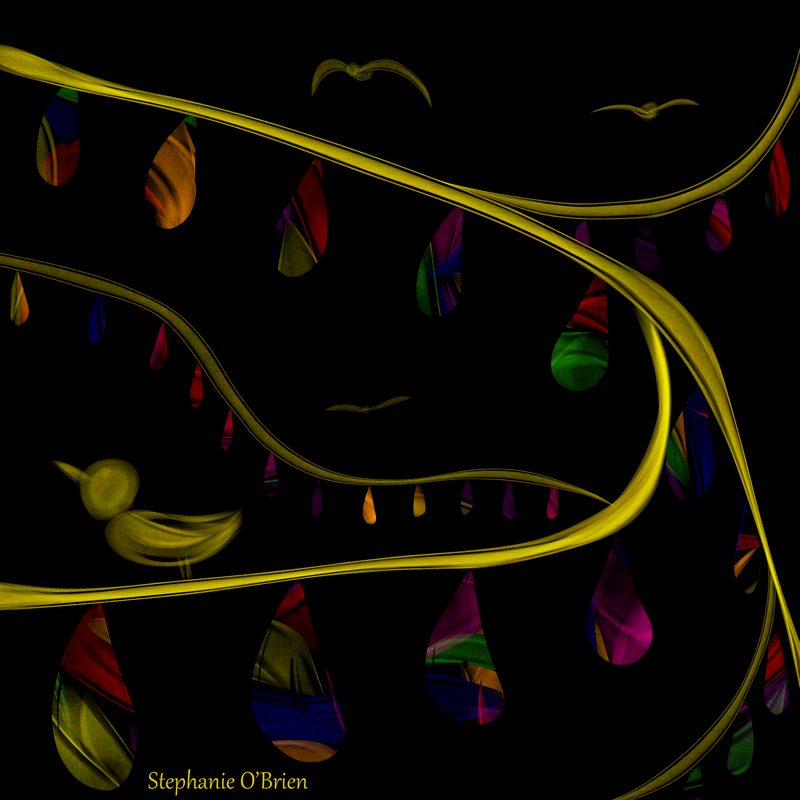 Butterflies and SnowFlowers Full Collection + Drawing Process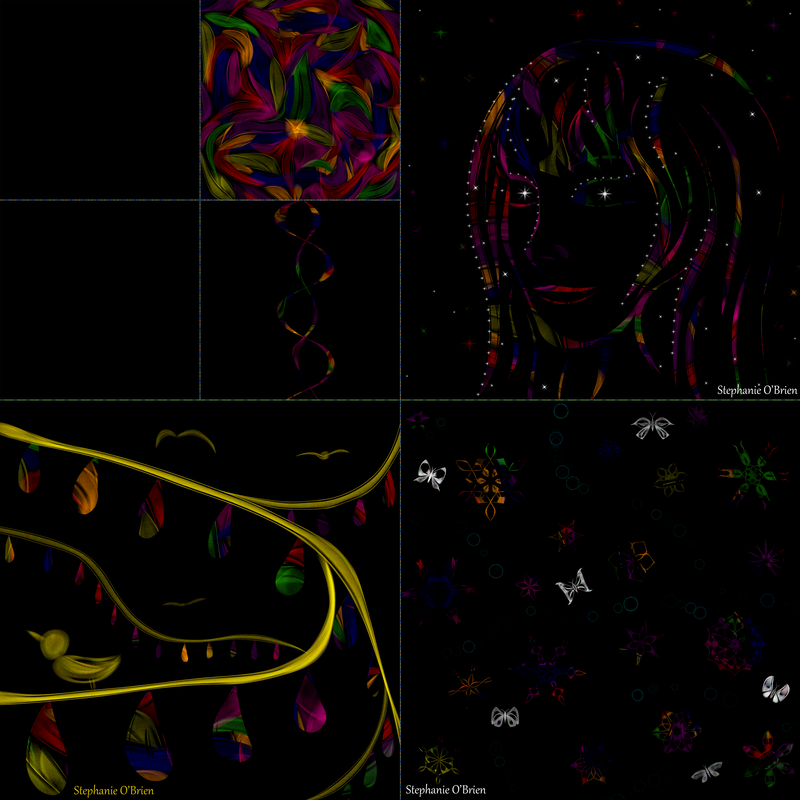 To create these pictures, I started by making a black layer. Then I added a layer of color on top of it, then another black layer. After that, I used the eraser to remove parts of the upper black layer, thus revealing the colors beneath in my chosen shapes. In response to the course's recommendation, I also added layers, colors and shapes on top of the black layer, to add variety and interest. For example, the picture at the top of this post, "Maid of Stars and Rainbows", has stars added on top of her partly-erased black layer. Because it was a quick experiment for an art class, I didn't draw it at full 8,000 by 8,000 resolution like I usually do for my print-on-demand pieces, so it isn't available on the full range of products, but you can get it on coffee mugs, journals, shower curtains and more in my Society6 and RedBubble stores. In this case, I'd recommend RedBubble over S6, because it let me tile the image and thus add it to a wider variety of products and make it look better on them. Here's what some of the available products look like: 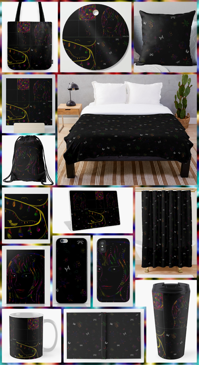 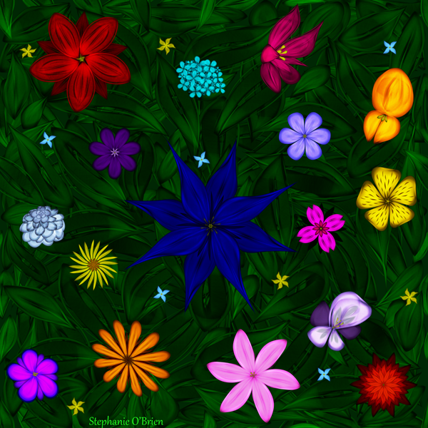 I was listening to Celestial Garden by one of my favorite composers on YouTube, and it made me want to draw some flowers. Almost everything in this picture was drawn with the same brush I use for my snowflakes, except for a few spots where I used a different, soft-edged brush to adjust the shading. It was a bit of a challenge coming up with enough different shapes to keep any of the large flowers from being repeats of the others, but thankfully Google was there with lists of different types of flowers. :) If you want to learn how to use the brush I drew this with, as well as the technique I used to create the symmetrical flowers, check out my tutorial here. The tutorial is geared toward drawing snowflakes, but the same brush/technique combo can be used to draw flowers, too. You can actually use it to create a fully shaded flower petal with a single stroke, once you've mastered it. It's available on coffee mugs, tapestries, pillows and more in my Society6 store, and most of them are 25% off today (June 9, 2019). Here are some examples of products adorned with Flying Above the Garden: 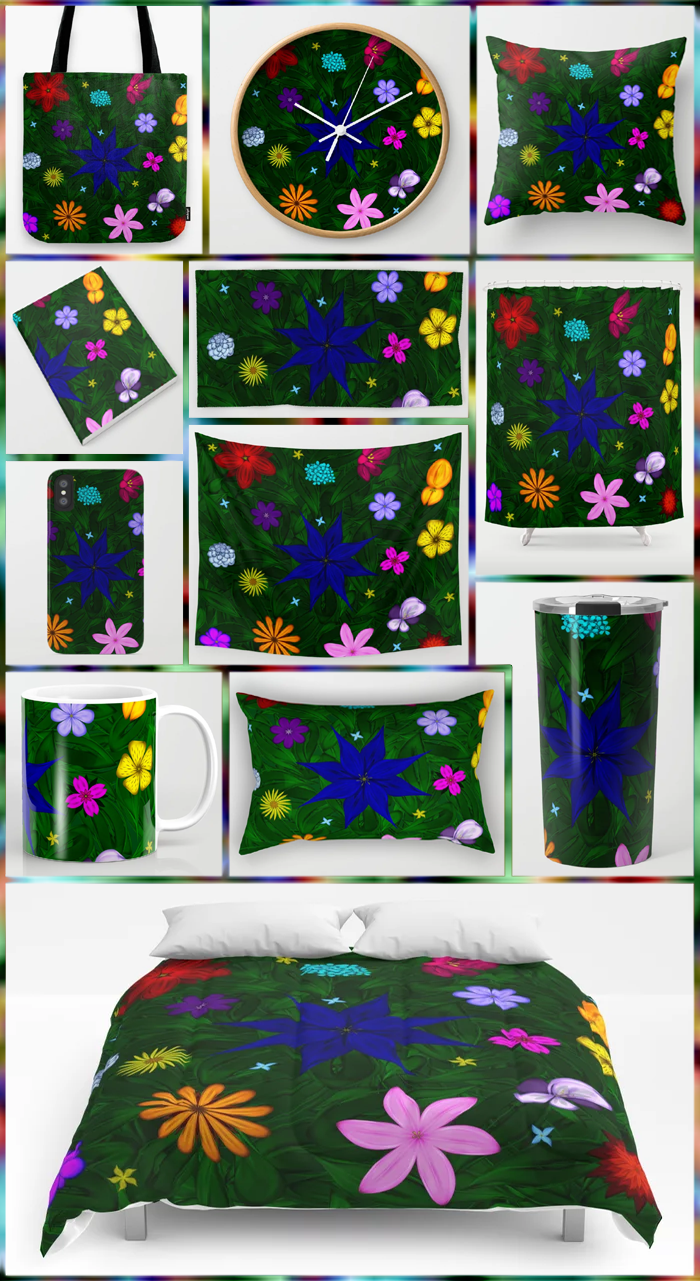 Here are the links, in case you see something you want:
Tote Bags Wall Clocks Throw Pillows Notebooks Hand & Bath Towels Shower Curtains iPhone Cases Wall Tapestries Coffee Mugs Rectangular Pillows Travel Mugs Comforters 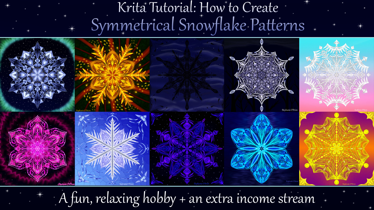 For the last few months, I’ve been sharing symmetrical snowflake patterns with you. This hobby has turned out to be so relaxing, fun, and surprisingly easy that I wanted to give you the chance to learn how to do it, too.
So I took all the tools, tips and steps I use to create these patterns, and I put them together in a series of bite-size video tutorials and published them on SkillShare. The class is 41 minutes long, and you can use this link to get an entire month of access for free! Go here to watch my snowflake tutorial. On top of learning how to create symmetrical snowflakes, you’ll also discover how to sell these patterns as prints and physical merchandise like coffee cups, so you can turn this hobby into an income source if you want to. I can’t wait to hear what you think of this class, and to see what kind of art you use it to create! Also, if you know someone who you think would enjoy drawing symmetrical patterns, please share this link with them. I really appreciate it! I've been following a fellow artist, CatSpaceDesign, on DeviantArt for a while, and was inspired by her beautiful and intricate designs. She published a basic symmetric pattern tutorial a while back, and I finally got around to using it to make a design of my own. 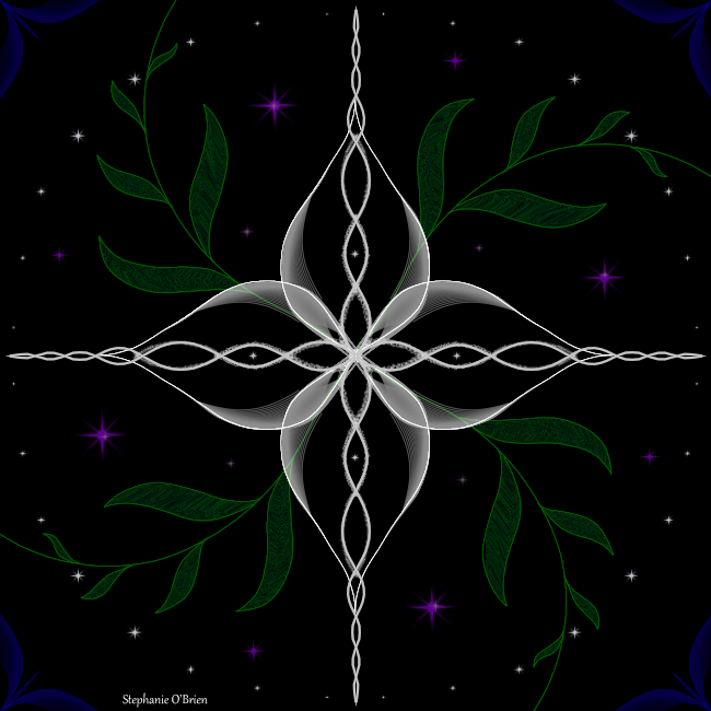 It's a lot simpler than most of her designs, and a bit rough in a couple places, but I'm fairly happy with how it turned out. I think I'll be making more of these in the future, on the days when I feel like drawing something other than Just Cause.
WHEN in the future, I'm not sure; I've learned to be cautious about making commitments to side projects, haha. But it was nice to draw something a bit less mentally demanding than a webcomic, and to just draw whatever looks nice and let it evolve as I went. Special thanks to my Patrons, Mica and Trish, for helping to make art like this possible. To support me as an artist, and to get exclusive access to works in progress and advance viewing of completed art, please consider becoming a Patron on Patreon! Quick Art Tip: Using Glow Effects When the Light Source is Darker than the Object it Glows On5/8/2018 I recently saw a picture in which the artist was trying to use glow effects, but ran into a problem because the shining soul that was casting the light was darker than the shirt it was casting that light on. I gave them a couple tips, and decided to share those tips here, too. 1. When a dark-colored light source is casting light on a non-black object, especially one with a lighter shade than the light source, make the color of the glow slightly lighter than the color of its source. When the light source's color is darker than the object on which it's casting light (like the soul compared to the shirt), it makes it look like the soul is casting pure color or even darkness on the object it's glowing on. 2. Add a lighter shade of the base color to the center of the soul, so it looks more like a light source. Here's a quick demo of what the abovementioned glow effects look like in total darkness and on clothing the color of the shirt they drew, so you can see the difference. 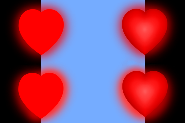 The two souls on the top are both casting light the same shade as their base color, albeit not at full opacity. Notice how the shirt seems darkened.
The souls on the bottom are glowing their base color in the dark, but on the shirt, the glow is lighter than the base color, so they aren't darkening the shirt. I hope that quick art tip helps! If you're an artist who uses Photoshop 7.0, and you want the size of your brush stroke to exactly match the size of your brush, you probably know the struggle. You carefully glide the brush or eraser in the exact place where you want it to take effect, grazing the edge of the patch of color that you want to enlarge or shave down... and nothing happens. The outer edge of your brush has no effect, Captain, and your perfect brushstroke was wasted. If you've been finding that only the very center of your brush will draw, there's a good chance that a feature called "Shape Dynamics" is activated. Shape Dynamics is supposed to allow you to control the shape of your brush by the way you angle and press down with your pen, and it actually has a positive effect on some brushes. But when you're trying to do precision work by barely grazing something with the edge of your brush, and you just want your brush to stay predictably at the same size, it becomes a huge hindrance. To make matters worse, there's no simple way to permanently turn it off in Photoshop 7.0. No matter how many times you turn it off, every time you switch to a brush that has it active by default, it will turn back on. I've heard tell of some legendary button that looks like a pen inside a circle, and supposedly it's supposed to solve this problem, but if it's lurking somewhere in my interface, I haven't been able to find it. If you don't have this button in your Photoshop, you have three options: 1. Resign yourself to using brushes with Shape Dynamics active. 2. Turn off Shape Dynamics every time you switch to a brush whose default settings include that feature being turned on. 3. The solution I found: create a new set of brushes with Shape Dynamics inactive. It's a bit tedious, but it's easier than you probably think it will be, and it permanently solves the problem of Shape Dynamics turning itself back on. NOTE: If you like Shape Dynamics in some scenarios, you can always turn it back on, or keep/create brush presets that include it. This process simply stops it from turning on by itself after you've turned it off. How to create new brushes without shape dynamics: Step 1: Select the brush you want to use without shape dynamics. For best results, start with the brush you want to have displayed at the beginning of your brush menu. Photoshop 7.0 doesn't allow you to change the order in which your brushes are displayed after they're created, so I suggest creating the brushes in the order in which you want them to appear. The new brushes will appear at the bottom of the selection, so if you want them to be at the front of the list, you'll have to create copies of ALL the brushes you want to keep in the order in which you want them to appear, and then delete the originals. This is the main reason why the process is so tedious, but it also gives you the chance to explore, modify and create some brushes that you might never have noticed or discovered otherwise. Step 2: Open the "brushes" tab. This tab is in the top navigation bar, just to the right of "File Browser". 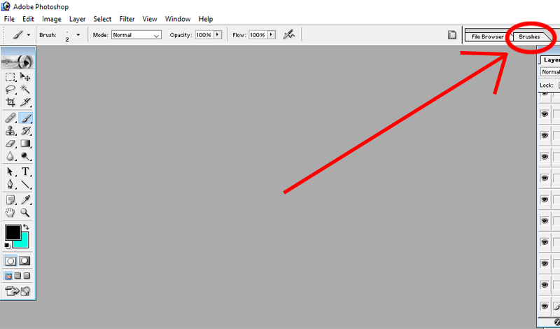 Step 3: Deselect "Shape Dynamics". As you'll see in the picture below, deactivating this feature means the brushstroke is always the same size as the brush, rather than shrinking at the ends or in response to brush pressure. As noted above, you can turn it back on anytime you want, but the next step will prevent it from turning back on spontaneously after you turn it off. 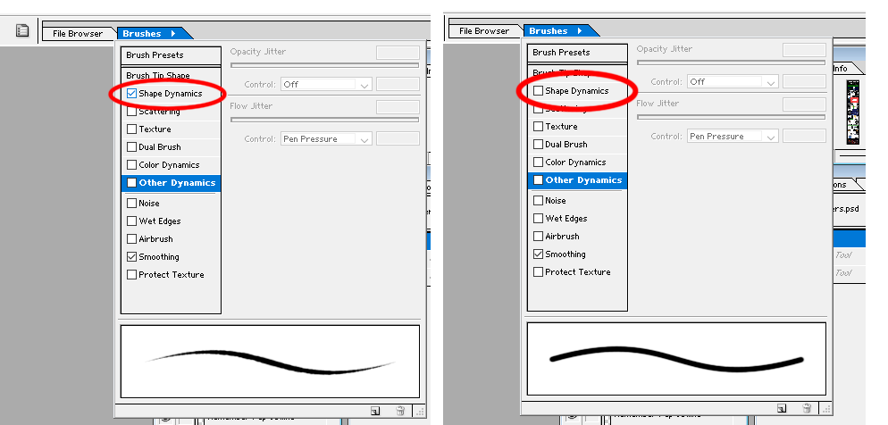 Step 4: While "Shape Dynamics" is inactive, create a new brush. At the bottom right of the "brushes" tab menu, click the icon that looks like a box with a smaller, bisected box inside it. You can see it circled in the image below. Once you've clicked this, a pop-up will appear, prompting you to name your new brush. After you click "OK", this new Shape Dynamics-free brush will be added at the bottom of your list of brushes. 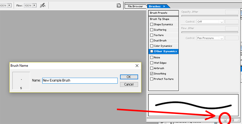 Repeat this process for every brush for which you want to have a version that has Shape Dynamics turned off by default. As previously noted, you should create the brushes in the order in which you want them to appear, since you can't rearrange existing brushes. If you want your new brushes to be displayed at the top of the brush list, you'll have to use this method to create copies of all the brushes you want to keep, then delete the originals. While you're doing this, you might as well arrange the brushes in the order in which you use them most, put ones you frequently use together close to each other, or otherwise organize your brushes in a way that suits you. I also encourage you to play around with the other brush effects while you're deactivating Shape Dynamics. You might find a new appearance for a brush that you didn't realize was available. Here are some examples of how brush effects change a leaf brush's stroke: 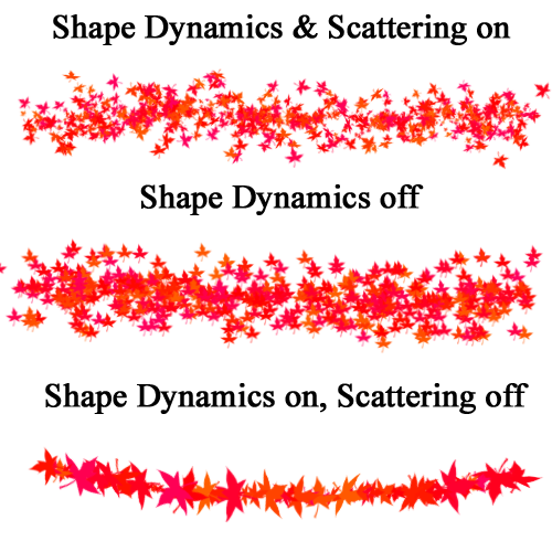 I ended up saving several different versions of some of the brushes, each with a different effect or set of effects active. While you're changing the Shape Dynamics and otherwise altering the brush before saving your new version of it, you should also set each brush to the size at which you're most likely to use it. Congratulations! You're now free from unwanted self-reactivating Shape Dynamics. I hope you found this article helpful. If you did, please share it with anyone else you know who's been cussing at Photoshop and unhelpful how-to articles for this issue, and check out my other art advice articles. And if you want to support me as an artist, storyteller, and provider of art and writing tips, please consider becoming a patron on my Patreon:  |
AuthorStephanie is the author of My Fugitive, Voice of a Silent Fugitive, Heroic Lies, and Catgirl Roommate, as well as the artist behind the Undertale webcomic Just Cause. Categories
All
Archive
March 2024
|
 RSS Feed